ATD Blog
10 Uncommon Educational Infographics
Tue Aug 23 2016
Research supports the theory that visuals improve understanding, recollection, and adoption. Many educators use stock photos and easily accessible graphics and infographic elements, such as puzzles, bar charts, and flow charts. Don’t stop there; there is a sea of options. Below are 10 types of seldom-used infographics that have proven extremely successful at communicating a host of concepts in your educational materials.
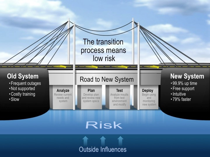
1. Bridge Graphic
This graphic is a metaphor depicting the connection or transition between two actions, concepts, or entities. A bridge connects two separate pieces of land. It crosses over water or highways to allow vehicles and pedestrians to pass safely. A bridge graphic is a perfect way to show the steps for transition. Process solutions (overcoming the risky waters), system integration, and many other concepts can be communicated succinctly using a bridge graphic.
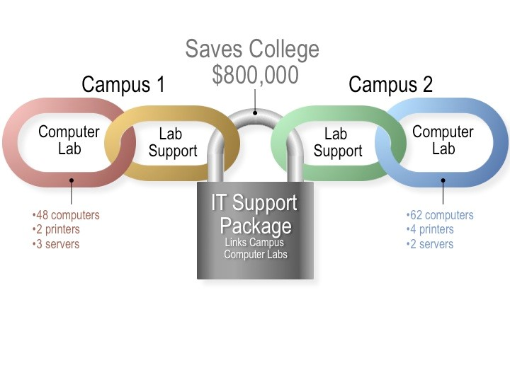
2. Chain Graphic
Chain graphics show "linked" actions, concepts, or entities. Alternatively, chains illustrate restraint or security. Instead of a Venn diagram, what about a chain diagram? Instead of showing linked concepts with boxes and lines, show a chain of departments, processes, or people to convey the same idea. Use a lock to show a (secure) connection between actions or departments. Or just overlay the chain on top of items to demonstrate security.
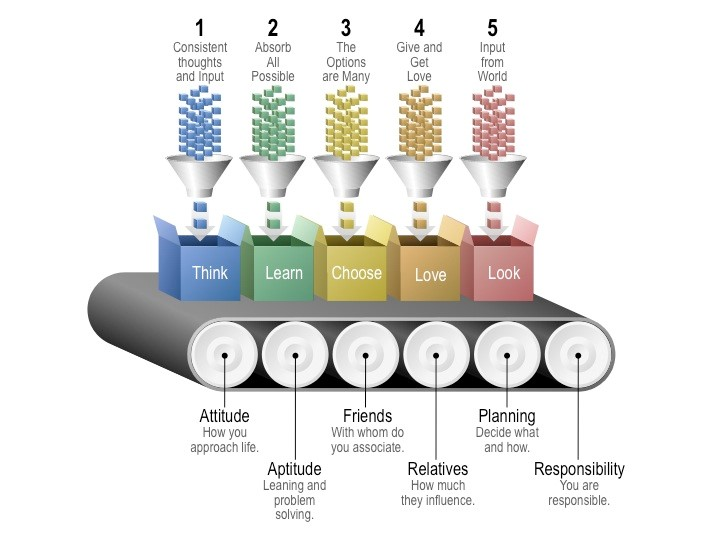
3. Conveyor Belt Graphic
This graphic is a metaphor that depicts a repeatable linear process. Conveyor belt graphics are a great way to show forward movement in a process such as assembling a product, recruitment and training steps, lifestyle enhancements, course overview, or system development.
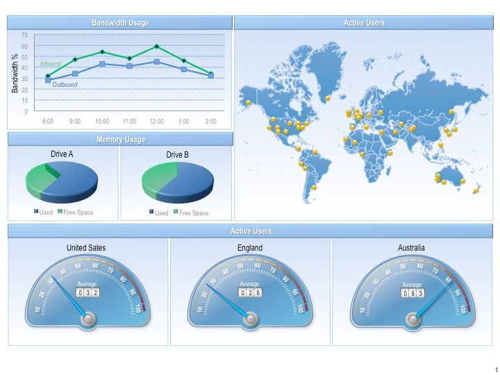
4. Dashboard
Dashboards present multiple metrics—potentially using multiple graphic types—in one consolidated format. It is a “holistic” view of information. On multiple slides or pages you may have pie charts, maps, and line charts that all relate to one another. Why not put these objects on one introductory slide or page to help your audience reach a desired conclusion? Dashboard graphics are best for sharing and learning quantitative information.
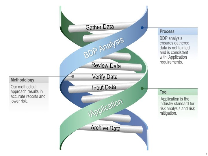
5. DNA Graphic
This graphic illustrates the synergy of multiple actions, concepts, or entities. They combine to create a new, better solution (and breathe new life into the project). The DNA strands can represent two key concepts (such as a software tool and a corporate process) with chromosomes connecting the two through common elements (such as activities needed to combine the strand content).
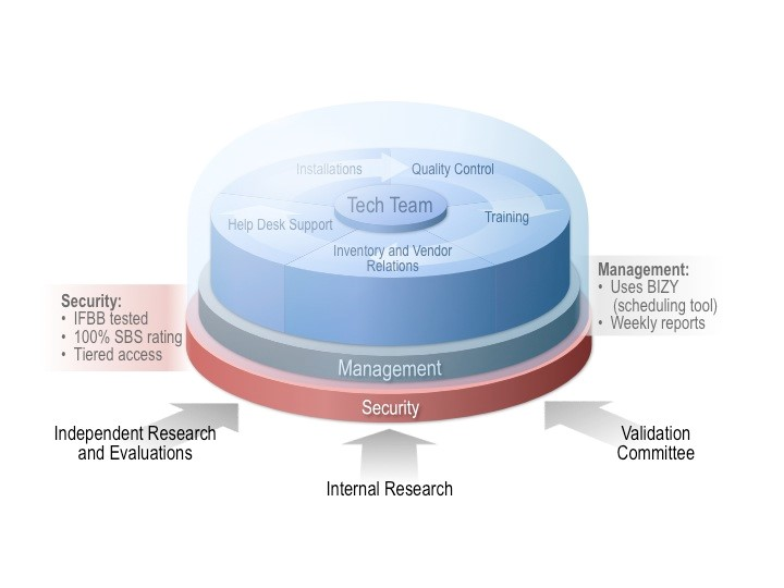
6. Dome Graphic
A dome graphic looks like a snow globe and illustrates the containment of elements. The dome graphic is great at communicating protection and security. Generally, you combine a “stacked graphic” (shown here) with the dome to show levels in a system, process, or methodology and how the levels relate to those in a secure environment—the dome.
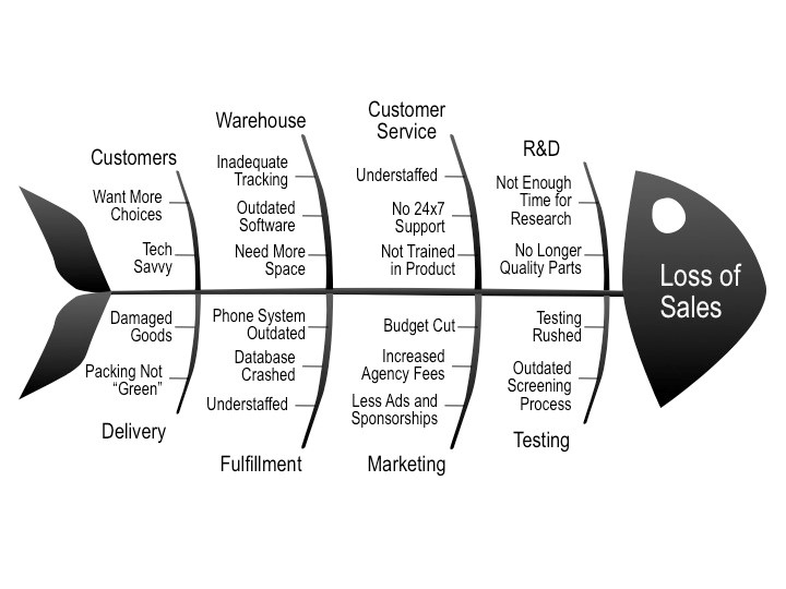
7. Fishbone Diagram
This graphic shows all factors that have an effect on a problem or objective. (Think cause and effect.) The small bones can represent categories, strategies, processes, or departments that join at the spine to create the final outcome.
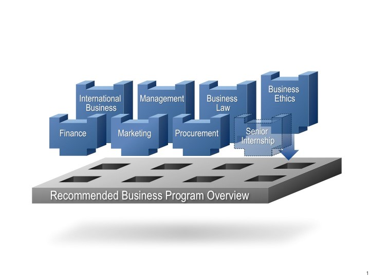
8. Peg Graphic
This graphic shows the interconnectivity of actions, concepts, or entities to create a unified whole (think Legos). Use a peg graphic for systems connecting and interacting with one another, building a process, or departments coming together to form an improved or upgraded solution.
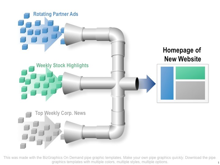
9. Pipe Graphic
This graphic represents the isolated flow of elements. Instead of a flowchart, use a pipe graphic to represent concepts such as consolidation, synthesis, or combination. Inversely, a pipe graphic can illustrate dispersion or diffusion. Pipe graphics are versatile and can communicate a wide variety of concepts.
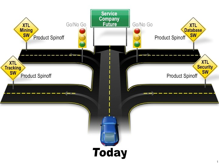
10. Road Graphic
This graphic depicts the path between the “as-is” or “before” state to the “to be” or “after” state. Like the bridge graphic, a road graphic can show transition and a connection for a process or system. A road graphic is perfect for demonstrating a future state or a long-term goal that is “down the road.” It could also be used as an ending to a presentation to illustrate the goal reached at the end of the process.
The next time you’re faced with creating a graphic, why not try something different? Consider these graphic types and how you can communicate your ideas in new and fresh ways—and give your audience a presentation they will always remember.