ATD Blog
How to Align Your Team on Near-Term Priorities—in Just 2 Hours
Thu Sep 21 2017

We’ve all had that “uh-oh” moment: We think everyone on the team knows the project goals, agrees with the direction, and understands their role. Then someone asks, “Why are we doing this?”
Fewer situations are more frustrating than when your team is not in alignment, whether it’s disagreement about a project goal or an individual feeling disenfranchised. Lack of agreement has real costs, especially wasted time and resources.
Human centered design offers highly effective methods that can empower teams to reach a shared understanding of a current situation—and then align on the most important things to address.
Fortunately, alignment can be accomplished in a two-hour session or across two meetings, using four design methods.
Getting Started
Set aside two hours in a dedicated space. Invite your team and key stakeholders, with a clear description of the situation the group will consider. The ideal size is six to eight people, but larger groups can work, too.
Capture Your Data with Rose, Thorn, Bud
It’s important everyone participates no matter their role, so everyone gets the chance to have a voice and you capture all the knowledge in the room.
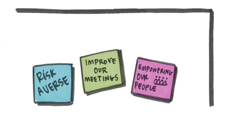
Ask each person to reflect individually about the situation you’re working on. Give them 10 minutes to write down (see Figure 1):
two positive things that are working well, on pink sticky notes (roses)
two negative things that are obstacles, on blue sticky notes (thorns)
two things with untapped potential, on green sticky notes (buds).
Figure 1: Rose, Thorn, and Bud
**

**
Reveal Thematic Patterns With Affinity Clustering
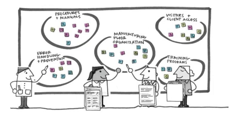
Next, invite discussion and identify themes you have in common. Gather everyone around a whiteboard or lined wall space big enough to display all your stickies. Have team members read each sticky note out loud, allowing for explanations and questions. As you go, begin to group the sticky notes into clusters of similar themes. Create big and bold labels that everyone can read from a distance.
Once all the input is placed, patterns will emerge as a color-coded heat map—clusters that are positive (mostly pink), negative (mostly blue), or have potential (mostly green). At this point, you will likely see a powerful moment of visual clarity from team members: “Oh, it’s all right there!” (See Figure 2.)
Figure 2: Color-Coded Heat Map
**

**
Flag the Best Options with Visualize the Vote
Allow the group to identify the most significant areas to focus on. Then, introduce a quick vote. Give everyone a moment to individually consider which clusters they feel are most important to address. Next, ask everyone to vote at the same time by placing sticky tabs on their top three choices. Voting simultaneously means no one can just follow what the top-ranking person does, and no one can swing the results by waiting to see where everyone else votes.
Agree on Priorities with Importance/Difficulty Matrix
This last activity allows you to identify areas that will deliver the highest impact for the least amount of time and resources.
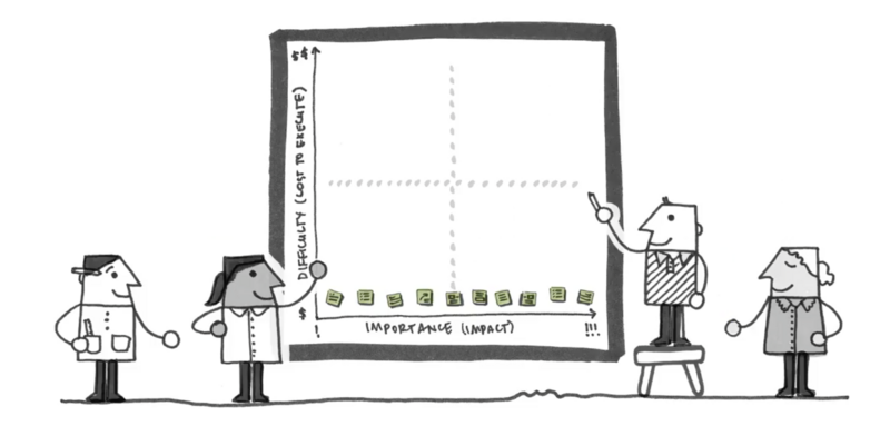
Transfer the eight to 10 themes with the most votes to sticky notes so you can easily move them around on a flipchart-size surface. Collectively rank the items in order of importance from least important on the left to most important or impactful on the right. Make sure there are no tied rankings (see Figure 3).
Figure 3: Ranking Priorities
**

**
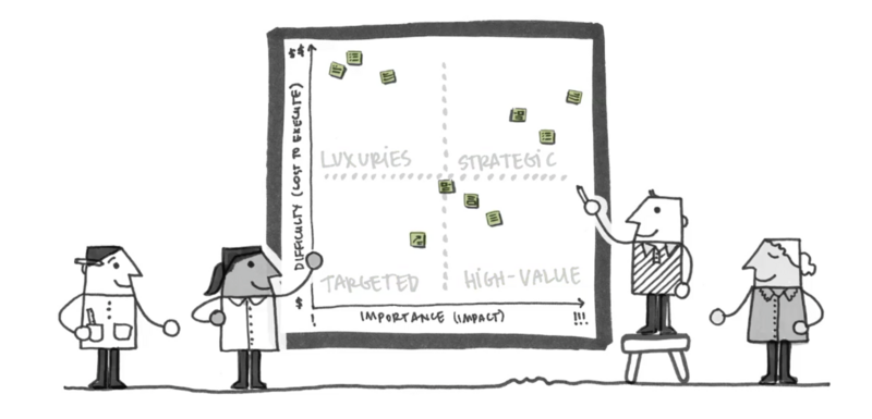
Once you’ve agreed on relative importance, then (and only then) assign a relative level of difficulty by discussing the relative “cost” of each item along the vertical axis — the lower the easier, the higher the harder. Be sure to maintain each item’s position left to right.
The final result will be a clear visualization of where the team should focus (see Figure 4). Consider hanging this document in a common area throughout your project as a quick visual reference.
Figure 4: Final Results
**

**
Ready to get started? Download our step-by-step instructions, agenda, and materials list.
