ATD Blog
Writing Skills for Instructional Design—Widely Used, Under-Acknowledged
Wed Feb 15 2023

In this two-part series, we will explore best practices for writing at every stage in the instructional design process. Effective writing ensures that your training materials are both effective and instructionally sound.
One of a learning and development (L&D) professional’s most widely used—and under-acknowledged—skills is written communication. Every stage of the instructional design process involves writing. We write:
Needs assessments and evaluation reports
Learning assets like job aids and participant handouts
Marketing and communication materials to generate interest in our programs
Text for curated sites about informal learning opportunities
Luckily, the skills a writer needs overlap closely with the skills you already have as a learning designer.
Know the Purpose
When creating training, we have to keep our outcomes or objectives top of mind; the same is true when writing. Our writing needs to convey what each item is meant to achieve. For example:
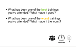
Slides are meant to engage learners and cue your facilitator so they can step away from their notes. This slide poses questions for participants and reminds the trainer of the discussion format, how long they have, and what page to refer to:

Participant workbooks lay out instructions and provide space for notetaking.
Reference materials serve as content refreshers. These materials need to stand alone so participants can recall content nuances without a facilitator present.
Facilitator guides help trainers stay on track and provide learners with a consistent experience. Paragraphs of scripted verbiage do not achieve this purpose. Effective facilitator guides are bullet-pointed with key points, transitions, and instructions highlighted.
Every piece of writing we produce—from wallcharts to emails to assessments—has a unique purpose.
Know Your Audience
As instructional designers, we often use learner personas—detailed descriptions of representative learners and their motivations and challenges—to create relevant and appropriate training. We need information about our learners for our written communications as well. When conducting a needs assessment, we should find out as much as we can about our learners so that our written materials hit those same benchmarks.
How do we gather this information? Asking about the languages learners have proficiency in, the writing style or tone most accepted in their work setting, and what the environment in which they will interact with our materials is like. For example, writing materials for preschool teachers in a bilingual education program will be different from those of an executive vice president of a bank. Job aids will be different for people who sit at a computer versus those who work on an assembly line.
Keep It Simple
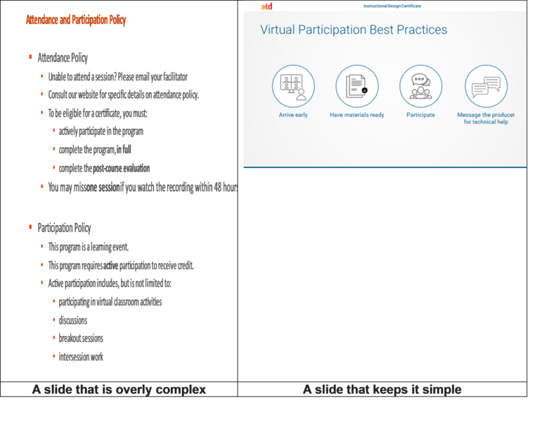
“Keep it simple” is one of the most universal suggestions for effective writing, and it has many parallels with our work as learning designers. We know, for instance, about the load we place on learners’ working memories when we provide too much content or unclear instructions and transitions. We’ve learned to chunk our content into bite-sized morsels to help ensure transfer to long-term memory. Similarly, our writing needs to be concise. Use lean text, short sentences and paragraphs, and simple word choice.
For instance, when creating slides remembering the 5x5 rule—no more than five bullets per slide and no more than five words per bullet. You can replace text with images and use simple language that get your points across.

Integrate Graphics
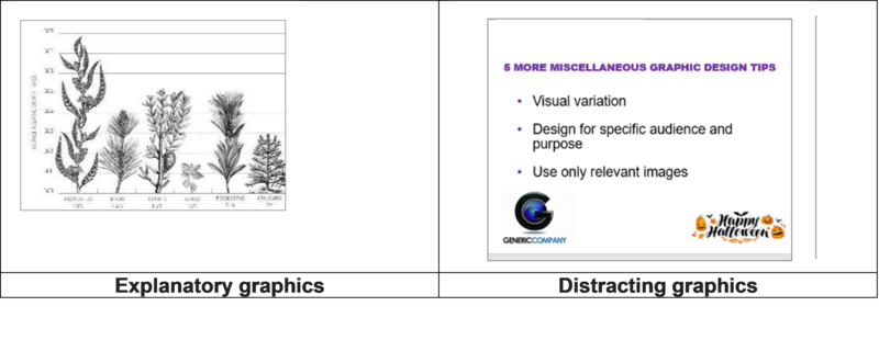
Visual representation conveys relationships, timelines, processes, and hierarchies in a compressed manner that helps with encoding into long-term memory.

Provide Structure
Writing for learning requires structure. Headings, subheadings, labels, and easy-to-follow, step-by-step instructions make written materials digestible. Someone who is familiar with the content might only need to scan the headings, while those who desire more detail can read the short paragraphs that follow. Provide tables of contents or indices for longer documents.
Integrate Universal Design for Learning
Instructional designers are integrating principles of Universal Design for Learning (UDL) to provide multiple means of engagement, representation, and expression. Employing these concepts is essential for some learners and good for all learners. Often this means that examples and quotes come from a variety of sources and perspectives.
When formatting using UDL, ensure that the contrast between the text and background on your e-learning screens is suitable for those with visual impairment; this will make the experience better for all users. (You can check for contrast at webaim.org/resources/contrastchecker.)
Be Consistent
When we change format or style midstream, written materials can create cognitive overload. Some organizations produce style guides to help keep writing consistent. While these often focus on the look and feel of published communications, they can also provide standards for your writing. They help us think about questions like: For what grade level are internal materials written? Is the voice academic or conversational? Are acronyms used? How do we capitalize work job titles or departments within the organization?
Clearly, written communication is a key capability for learning professionals. It’s also a skill we can improve. Knowing our purpose and audience, keeping it simple, and integrating graphics will make our writing more effective. Fortunately, these elements nicely align with foundational elements of instructional design.
